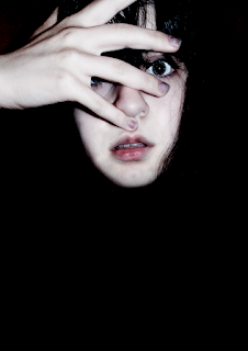
The measurements I used for this poster is the same measurements as an A3 paper (420 x 297mm).
The making of this poster was quite simple. The first step I took was to fill the background in black, as this is the most typically used colour for horror film posters.
I then added my image to the background, and then used the blending mode option 'hard light, which created a harsh effect. After this, I used the dodge tool to create some odd colouring to the lips and nails, to give it that 'beat' and 'grunge' feel.
After this, I used the gradient tool to feather out the neck and shoulders. I did this so I could just have the floating head image. Which I thought would be better suited in this case.

The next step that was partaken was to add the tagline 'Make sure that you are listening.', in which I used the Trajan Pro font. As this is the most commonly associated font with the horror genre. And which was found in the posters I researched too.
I then added the billing credits in which I used a font named credit block, which is free to use. After that I added a copyright notice on the bottom of the poster.
The following thing to do was to add some industry elements in which I added a 'original film' logo and created my own of 'deadwood films' to include on the opposing side.

After all this, I used the font 'Pulse Sans Virgin', which can be found at dafont. And then using the Trajan Pro font I added some final additions, such as the actor and actresses name, alongside the script writers name.
Once this was completed, I carried out the last step which was to add the paper texture on top, which gave it a nice finishing touch (I did not include the image here as it can be seen above).


No comments:
Post a Comment